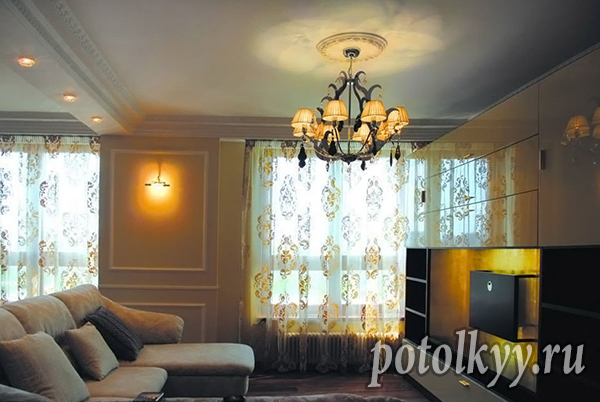
The influence of color on our thoughts and moods has been proven time and again. If we spend time in the living room or in the kitchen, being busy with business, then in the sleeping room we relax and try to just relax. As expected, the interior is always dominated by calm shades and diluted halftones.
What color to choose for the bedroom?
To answer the question of what color the bedroom should be, you have to take into account a whole list of recommendations and restrictions. South facing windows provide warm, hot light, and cool light colors will help balance this out. The north side will be made warmer by soft shades with an admixture of yellow. With the increase in the dimensions of the room, the field for creativity increases: you can afford more colors, patterns and decorative elements.
What wall color is best for a bedroom?
bedroom ceiling color
Traditional white for the ceiling is always appropriate and it goes well with all types of wall decoration, regardless of their color. If you use expensive auspicious colors for the bedroom, you should give preference to original and non-standard techniques. You should not be afraid of dark or too bright colors, because a lot depends on the number and location of the dark area above your head.
Light natural shades do not tire the eyes, suitable for almost any style and chosen colors in the interior. Instead of the usual white, preference is given to beige, gray, coffee or blue shades. Favorable colors for the bedroom are in the line of diluted halftones. If the goal is to fill the space with dynamics and make color accents, dark saturated ceilings will do.
Bedroom curtain color
The choice for windows is complicated by the fact that you have to select not only color options, but also monitor the density of the fabric and its performance characteristics. Among the fabrics at the peak of popularity, solid natural materials with deep natural shades, combine them with transparent matte curtains. When the decision is made in what colors to make the bedroom, you can proceed to the selection of textiles.
Having chosen the main colors for the bedroom, you are free to go in search of textiles in several ways:
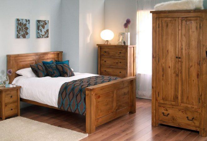
Bedroom furniture color
The choice of color solution for filling depends on the method of accentuation. Furniture white color for the bedroom it will look great on a dark background and will attract the eye, it will dissolve on a white light background and give the palm to textiles or decoration. When choosing wooden furniture, you have to remember about harmony and choose an identical solution for the floor: the saturation and depth of the wood pattern is necessarily different, but in the same color direction.
The entire interior is made either in monochrome or polychrome. Choose two shades for decoration, one or two more for furniture. The gradation from dark saturated brown to light beige looks good, it can also have gray impurities. It is difficult to choose a polychrome combination without a color wheel, where neighbor colors that match each other and enhancer colors that can make each other brighter are indicated.
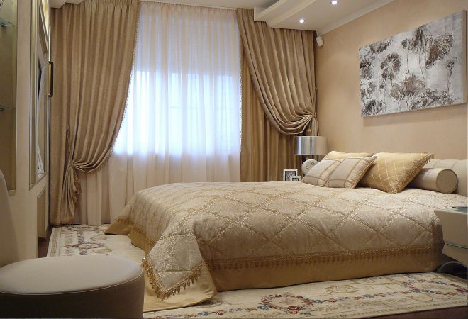
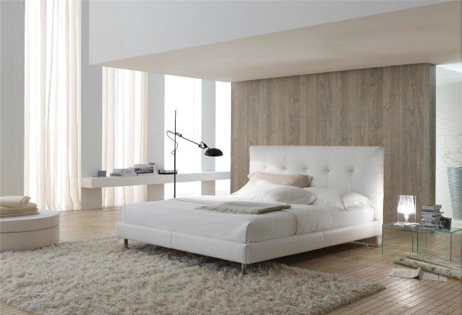
Bedroom bed color
The bed is often hidden under the bedspread, but its headboard and lower part are always out of sight. To decide which colors for the bedroom you will give for furniture, you need to know four fundamentally different approaches:
Color combination in the bedroom
No matter how much we want to get a calm, relaxing environment, we have to dilute neutral shades with accents. Otherwise, the design will turn out faceless and frankly boring. Choosing the right colors for the bedroom is only half the battle, you need to correctly combine them. Approximately 60% is allocated to the background, the rest share the second main shade and accents. For a monochrome range, it is permissible to allocate approximately 20% for accents, a polychrome combination suggests only 10%.
feng shui bedroom colors
The obvious decision, which is also the right one, is to give preference to a beige range from delicate milky to warm coffee. This will fill the space with warmth and allow positive energy to circulate freely. Eastern teaching advises how to choose the color of the bedroom, based on a combination of two principles:
Whatever combination you choose, whatever patterns and textiles you choose, this room should relax and create a feeling of peace and tranquility. Designers' recommendations should be taken into account, but not followed literally in everything, because your bedroom is your safe and comfortable place in the house.
Usage gray color in the interior has long been the subject of discussion among designers. Some consider gray boring and monotonous, while others, on the contrary, see a special style and character in this color. With the advent of stretch ceilings in modern design, the debate only intensified, because the ceiling is one of the most important areas, the color scheme of which determines the overall impression of the room. About using gray stretch ceiling in the interior and will be discussed in this material.
Gray - in moderation
The main claim of designers to gray is its coldness and excessive restraint. Indeed, if most of the design elements are done in shades of gray, this can create a gloomy and oppressive atmosphere. In a room completely done in gray tones, it is easy to feel depressive changes in mood. But in this case, it's all about the details! If gray is chosen as the main color for the stretch ceiling, then a significant part of the decor or furniture elements should have a more saturated color scheme, depending on the specific style.
Excellent base for the interior
Grey colour unanimously recognized by designers as an excellent basis for all other colors that will be present in the interior. Its task is to set off the intensity of bright colors and emphasize the tenderness of pastel shades. Gray is an excellent background for expensive and refined furniture. Fans of industrial and urban styles, as well as hi-tech and loft trends, find gray in their interior design. Details of communications, gray metal structures create an impressive contrast with elements of warm colors: furniture, rugs, pillows.
The choice of a gray stretch ceiling for the office allows you to emphasize the solidity and seriousness of the people working in it. Using painting, appliqué or large-format printing in the design of the ceiling, you can visually add light to the room.
The benefits of gray
Gray has proven to be a great backdrop for works of art decorating offices, living rooms and bedrooms. Used in combination with white, gray allows you to expand the space. In addition, designers highlight a number of undeniable advantages of gray:
- giving a special charm to inexpensive materials and simple textures
- practicality
- functionality
- versatility
- the ability to hide imperfections, including dust
If you decide to opt for a gray stretch ceiling, pay attention to its texture.
IMPORTANT
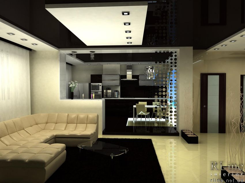
In the first photo - a gray stretch ceiling installed in the kitchen. It is clearly seen how the reflective surface of the coating visually expands the space. At the same time, if you prefer velvety, matte textures, they will also be quite appropriate, but in an interior with higher ceilings.
Fifty Shades of Gray
Indeed, there are a great many shades of gray, ranging from deep, dark tones to warm pearl gray, brownish gray. The choice of shade depends, of course, on the specific design task. Saturated dark gray is rarely used as an interior color scheme, with the exception of the bedroom. But even in this case, the design contains a large number of light colors, which makes the whole interior look seasoned, calm, but not gloomy. When planning a dark gray stretch ceiling, remember that it is better to use it in combination with lighter tones. As an option, the central composition of the ceiling, made in dark gray, is framed by a white plasterboard box. If a decision is made to decorate the hallway with a dark gray ceiling, then take care of a sufficient number of powerful light sources.
Medium and light shades of gray are suitable for residential use. But even for a medium gray ceiling, it is necessary to think over a sufficient number of light elements - this harmonizes the atmosphere as a whole. Light shades of gray look quite complete on their own and therefore do not require dilution with other colors.
What goes with gray?
Since gray is a good neutral background for any color, stretch ceilings are no exception. White, black and gray are achromatic colors, so when using them in the interior, it is necessary to add a second color from this range.
First of all, designers recommend combining gray with warm colors: red, orange, yellow. These are quite intense colors, but gray makes them ideal for use in interior design, emphasizing dignity and shading.
NOTE
The brightness of the selected color should be lighter than the shade of gray.
Also interesting is the combination of gray with cold tones: pink, lilac, eggplant. Typically, these colors are used to create a feminine, glamorous style. At the same time, discreet purple tones, coupled with a gray ceiling, create a discreet and at the same time interesting masculine interior.
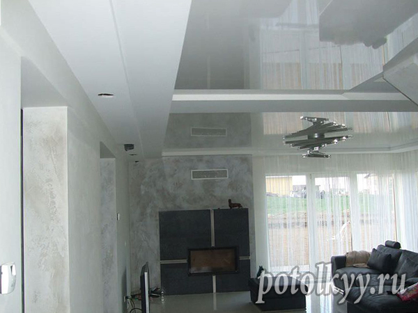
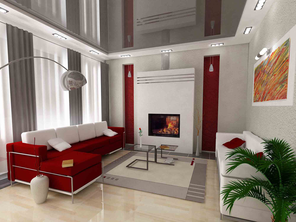
White and gray, black and gray are classic pairs that are perfect for decorating living rooms and offices and creating a seasoned atmosphere in these rooms.
Gray is a universal color, so most of the colors used in the interior are combined with it. The main thing is to follow the chosen style and carefully select shades. It is important to remember that those colors with which it is recommended to combine a gray glossy ceiling should not occupy a large horizontal surface. Reflecting a red plane, a shiny gray ceiling will appear greenish gray. If large green objects are reflected in the gray ceiling, they will turn it into a reddish one. Therefore, you need to pay attention to the location of colored objects relative to the glossy surface of the ceiling.
The possibilities of this color allow it to be used in almost any room.
The gray color in the living room creates an atmosphere of restraint and tranquility, helps to recuperate in stressful situations. Bright color spots are needed here so that the feeling of security is not gradually replaced by a depressive feeling.
A gray stretch ceiling in the bedroom is a good contribution to a comfortable stay, especially if the tone of the ceiling exactly matches the tone of the walls. Designers advise choosing lighter, lighter shades of gray: delicate silver, pearl.
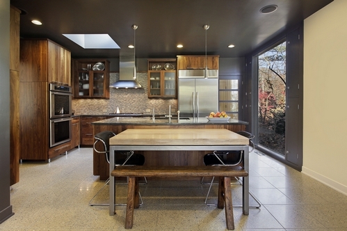
The kitchen has long been a testing ground for the use of gray in the design due to the mass production of metallic household appliances. And of course, the gray stretch ceiling in the kitchen is very appropriate. Here, experts recommend glossy surfaces, since the kitchen is a place of high humidity. And in this case, the matte material loses to the shiny one. The thin glossy film quickly warms up to room temperature, which eliminates condensation. The bright surfaces of modern kitchen sets look interesting in combination with a gray ceiling.
- also an interesting solution, since this room, like the bedroom, is a place for comfortable relaxation. To achieve this effect, it is necessary to ensure that the light tone of the ceiling matches the tone of the wall material.
Obviously, gray is an excellent base for the design of the living room, bedroom, kitchen, bathroom, as well as office space. Gray, as a neutral achromatic color, goes well with most of the tones of the spectrum, making it a versatile base in almost any modern style. Usage gray stretch ceiling will give a unique atmosphere luxury And comfort any room.
White color is considered the most optimal for the ceiling. Dark is perceived as a kind of interior extreme. It is widely believed that dark ceiling will definitely press, making the room visually lower. Considering that standard apartments are already deprived of height, any other options, except for the brightest ones, are usually not even considered. However, with a dark ceiling, not everything is so simple and unambiguous.
Contrary to stereotypes, a dark ceiling can visually increase the height. After all, it is like the night sky. Does the sky press? No, it goes into the depths, into infinity! A dark ceiling can also be perceived.
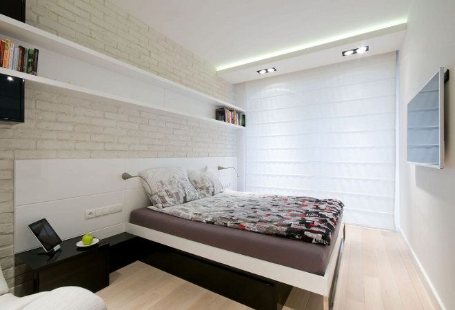
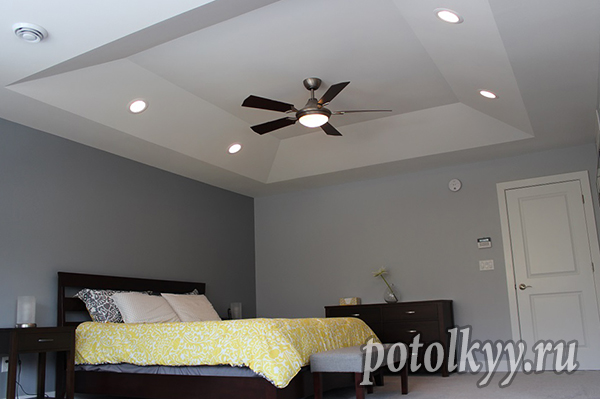
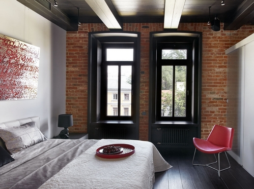
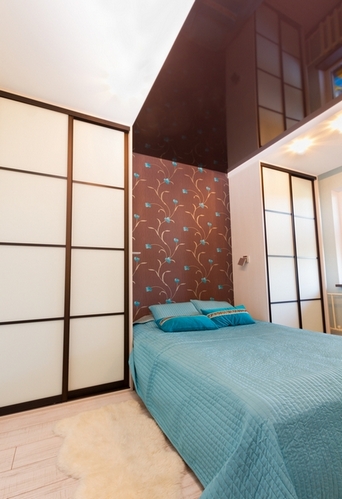
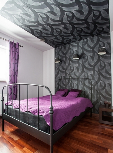
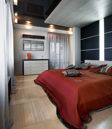
A dark colored ceiling works well in a bedroom. It makes the room sleep friendly. This design option is especially suitable for those who often sleep during the day. With a dark ceiling in the bedroom, it will always be evening.
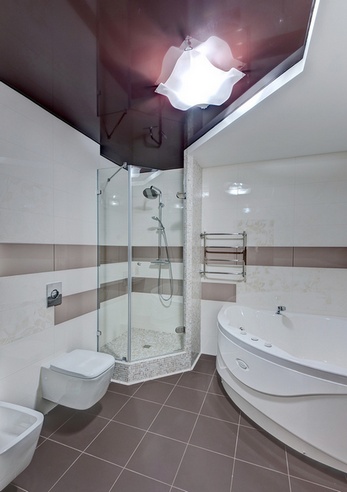
For the same reason, the dark color of the ceiling is relevant for the bathroom. This room is for many a kind of home SPA-salon, in which a relaxing atmosphere is desirable. The "twilight" created by the dark ceiling is very useful here.
dark bathroom ceiling
In essence, the dark ceiling is a daring, extraordinary and effective solution. The room with him will never be simple and dull. But this obliges: you need to more carefully select the decor and decor.
If you decide to take this bold step, our recommendations can be useful to you.
Dark ceiling in the interior: rules and techniques
1. Actual height. Opting for a dark ceiling for a low room is a significant risk. This idea should be seriously considered only if the height of the ceilings is not less than 250 cm for the bathroom and 270 cm for the kitchen and rooms.
The higher the ceiling, the darker its color can be. In rooms with a height of 3-3.5 meters, even jet-black ceilings will not crush.
2. Influence of shades. Cool and cold tones just create a semblance of a bottomless night sky. Such a ceiling can cope with the task more successfully than white. visual magnification height. Shades from this group: grey, grey-blue, grey-blue, graphite, etc.
Warm tones visually approach us, so the brown ceiling is likely to noticeably “sink”. Therefore, it is suitable only for a very high room. But if the effect of "pressure" does not scare you, feel free to ignore this thesis.
By the way, the brown wooden ceiling, although it seems lower than it is, but it makes the room cozier. A tree is always a tree: it warms, soothes, pacifies.
3. Ceiling frame. To make the walls seem a little higher, you need to enclose the dark ceiling in a light frame, that is, create a narrow or wide border in the color of the walls around the perimeter of the ceiling.
The walls in this case, of course, should be light. This will visually increase their height and prevent the ceiling from “falling down”.
4. Dark frame. If the task is to visually lower an overly high room, the reverse technique will be effective: you need to put the ceiling on the walls, that is, create a dark wall border encircling the room.
The dark ceiling in the photo above was created in order to visually reduce the height (project by the architectural studio Svoya studio)
5. Combined option. When in doubt, you can opt for a discreet two-tone scheme, which involves the inclusion of dark fragments in the light field of the ceiling.
These accent areas can work for zoning. For example, a dark rectangular insert on the ceiling will highlight or bed in the bedroom.
By the type of materials used, such a two-color ceiling is, as a rule, combined. For example, a light suspended structure can be complemented by a dark stretch insert, and a light painted ceiling can be complemented with dark-colored wallpaper.
6. Combination with the color of the walls and floor. Of course, a variety of combinations are possible here, but the most versatile choice is neutral light walls. The floors can be and. In which case it will always be possible to lay a light carpet on them.
If the room itself is bright due to large windows located on the sunny side, some of the walls can be made dark.
In a dark interior, furniture should be light, because contrasts are simply necessary. Few people will be pleased with the interior, all the components of which merge into a single dark spot.
7. A large number of light sources. Dark colors absorb light, unlike white, which is reflective. Be prepared for the fact that with a dark ceiling, the room will become much more gloomy than with a light one.
Electric lighting will save you from gloom, which should be as much as possible in a room with a dark ceiling. Additional light sources are especially important in areas farthest from the window.
Don't let window treatments block the flow of natural daylight. Having chosen a dark ceiling, use a transparent veil on the window. If possible, leave the windows completely “undressed”. Light and cleanliness in themselves are a wonderful window decoration.
8. Color consistency. The ceiling should harmoniously coexist with the rest of the interior elements. So, if the room is made in beige and brown tones, the black ceiling will be inappropriate - it will completely ruin the interior.
It is not necessary that the color of the ceiling be repeated in some detail, but it should be organically woven into the main palette, and not contradict it. For example, in a gray and white room, a black ceiling will be successful, since all the tones used are from the same achromatic family.
The dark gray top will go with almost any environment. A colored ceiling (for example, blue or purple) will be a spectacular accent in a monochrome neutral interior. But if desired, the color of such a ceiling can be tied to the color of the floor, upholstered furniture or other interior components.
In this article, we will consider what a gray stretch ceiling is. Thanks to the large selection of colors, you can choose a suitable hinged canvas for almost any interior. If until recently a white matte finish was installed, now many are striving to create a unique and inimitable design using colored canvases. One of the interesting, and at the same time "dangerous" colors is "wet asphalt" or ashy. Many are skeptical of him.
Some people think that it is boring and monotonous, others, on the contrary, it is interesting and stylish. Despite the fact that opinions are divided, gray tensile structures go well with any style. Such a coating will be appropriate, both in the kitchen and in the bedroom.
However, so that the room does not seem gloomy and gloomy, you need to choose the right color.
Shades
To date, there are a huge variety of shades of ashy, ranging from warm pearls to dark, deep tones. The choice depends on what effect you want to create in the room.
It is worth noting that rich ash is rarely used when creating a design. However, if you dilute it with light colors, the room will take on a restrained and calm look. Before deciding to install tensile structure with an ash-colored canvas, it is recommended to see the photo as an example.
On a note: Light and medium shades can be used in decorating, for example, a bedroom or an office. You don't have to dilute them.
With what to combine?
In order for the room to look stylish and modern, it is necessary to combine colors correctly. Ash is in perfect harmony with:
- warm tones: yellow, red and orange (despite the fact that these colors are bright in combination with gray, they look appropriate);
- with cold tones: eggplant, purple and pink (the room will acquire a modern and feminine style, in combination with purple the room will look stylish and restrained);
- white and black (a great solution for decorating living rooms and offices).
Gray is a versatile color, so it looks great in combination with many colors.
It is considered an excellent basis for all other colors used in the interior. With it, you can easily emphasize delicate pastel shades and at the same time set off the brightness of warm tones. It is also an excellent backdrop for expensive and sophisticated furniture.
Gray ceiling in the interior
When choosing a coating, you need to pay attention to how it will be in harmony with the interior.
Living room
To create a restrained atmosphere in the living room, platinum and mother-of-pearl are the best fit. To prevent the living room from being gloomy, you need to add bright, warm colors.
Bedroom
For the bedroom, it is best to choose a silver or pearl color scheme. They will create a cozy and comfortable environment.
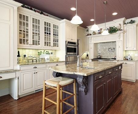
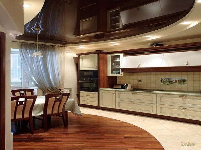
Kitchen
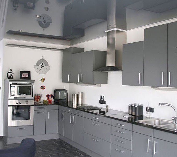
The gray stretch ceiling is the perfect solution for the kitchen.
It is worth noting that only a film coating should be chosen, since it not only retains water well, but in the event of flooding, condensate does not form. Glossy canvas works best. Due to the reflective surface, the kitchen will visually increase, it will become lighter.
Advice: To make the room look interesting and modern, you can add bright colors.
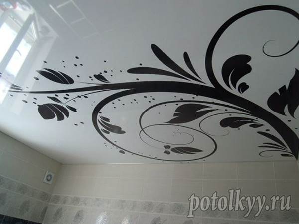
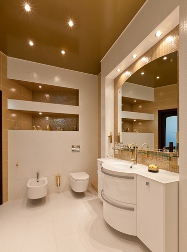
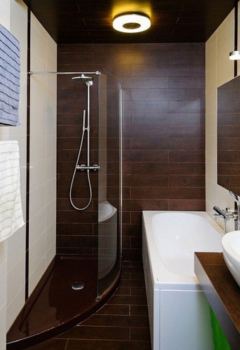
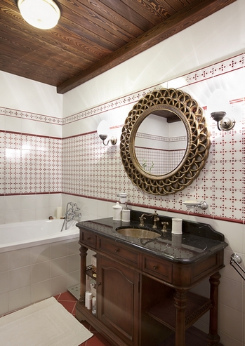
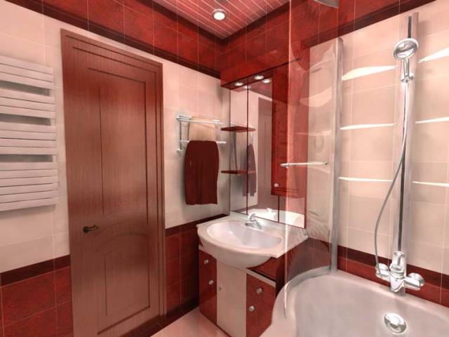
Bathroom
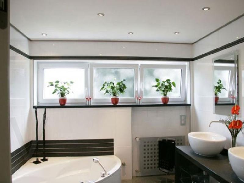
A platinum or “dusty” ceiling is also appropriate in the bathroom. It promotes relaxation and comfortable rest. To create an interesting design, you need to add light colors.
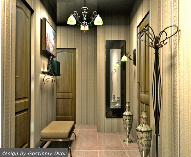
Hallway, corridor
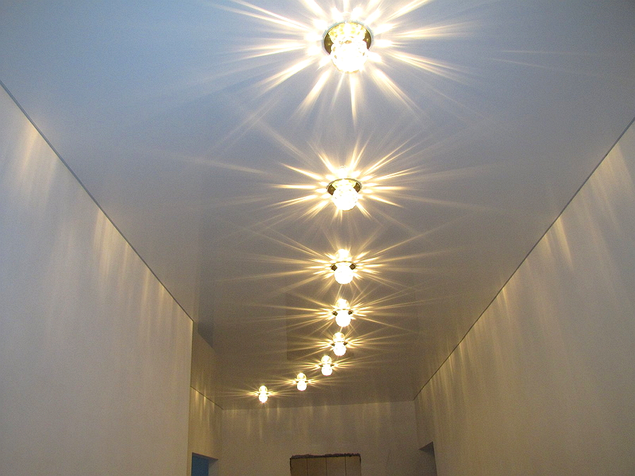
A dark gray ceiling is suitable for the hallway and corridor. However, to make the room look cozy and comfortable, it is necessary to install a sufficient number of lamps. Due to the bright light, the area will visually increase, the narrow corridor will seem wider, the hallway will be more voluminous.
Related videos
Regardless of what materials will be used in the decoration of the room, it is imperative to consider whether there will be dissonance in their neighborhood. After all, the combination of colors of the walls and ceiling will affect the perception of the interior as a whole, your mood and psychological comfort.
The surfaces of structural elements can be of almost any color: both plain and patterned; with geometric patterns and combined; stylized as natural materials and with the image of animals. The main thing is to beat all this correctly and observe the measure.
Selection criteria
So:
- First of all, the color of the ceiling and walls is selected for a room that has certain functions: what is good for an office will not look good in a kitchen or bedroom.
- The color scheme will depend on the chosen design of the ceiling, the height of the room, its volume. Even if the ceiling without intricate shapes is ordinary, putty for painting, it is possible to get almost any shade.
- It is better to match the color of the walls to the ceiling, and there are some nuances that must be taken into account. Let's say the height of the ceiling can be visually changed, using a dark accent on the top or bottom surface.
- There is a golden rule: if you want the ceiling to appear higher, it should be light and the floor dark. With just the opposite. The darker the ceiling, the lower it will appear.
- High ceilings are the prerogative of mansions and houses still built by Stalin. Most apartments in high-rise buildings have a ceiling height of 2.5-2.8 m, which cannot be called big.
And the footage of some rooms is simply scanty. So the color of the walls and ceiling plays a role in the perception of not only the height, but also the volume of the room. - The north-facing windows of the room make it gloomy even in the daytime, so the color scheme of the interior should lean towards bright colors and warm shades. The color of orange and the sun will not allow you to feel dreary and uncomfortable in winter, making up for the lack of natural light.
depending on the sun
With rooms oriented to the south-east, the situation is reversed. An excess of ultraviolet radiation creates stuffiness and a desire to lower the blinds.
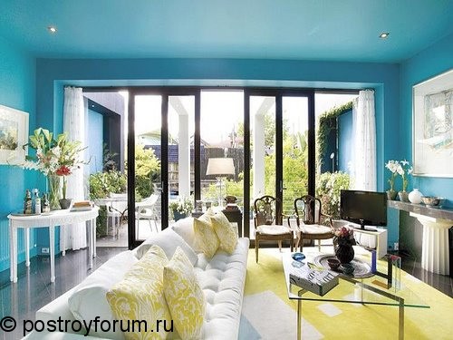
For such a room, the ideal option would be the color of aqua, turquoise or grass (see).
Rooms without windows
In rooms that do not have windows (entrance halls, corridors and bathrooms), it is better to use light colors, with an emphasis on any element. As a theater begins with a hanger, so does an apartment begin with a hallway.
Any incoming person makes the first impression of the owner precisely by her.
You can, of course, move away from the stamp and finish the hallway in darker colors - why not, because a lot also depends on the size of the room. In this case, the lack of light can be corrected with a good backlight.
If you decide that the ceiling in a small hallway should be stretched, then you can solve the problem of space using a bright glossy canvas. The walls of the room, reflected on the surface of the ceiling, will give the impression of a high corridor.
As for the design of the bathroom, you can not limit your imagination here: a bright colored ceiling looks just as great as the traditional blue-green-blue shades - it all depends on your preferences (see).
You are not in this room for a long time, so the combination of the color of the ceiling and the walls of the bathroom simply does not have time to exert a psychological impact. The main thing is that with taste.
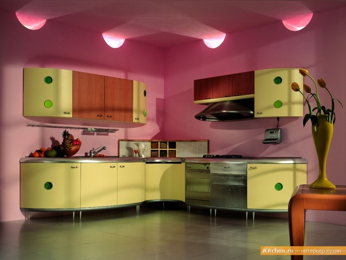
The kitchen as a field for experiments
- This room should not just be cozy, the combination of the ceiling and the color of the walls, creating a certain range, can also control appetite. And this is a whole science.
- To tightly control the process of nutrition, you need to choose colors that inhibit the desire to eat. Green and blue colors, as well as their shades, easily cope with this task.
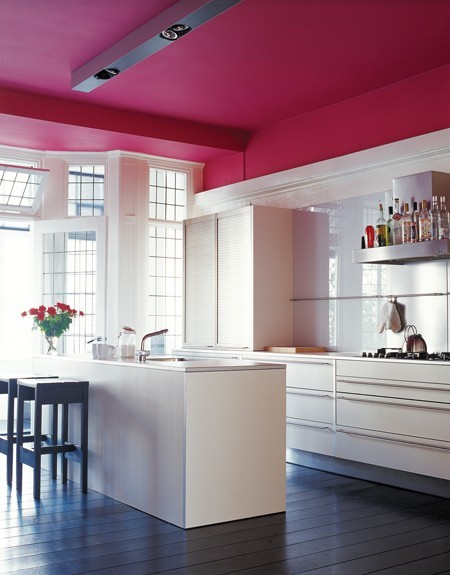
Well, if you need to stimulate your appetite, feel free to choose bright, orange, raspberry or yellow colors. - Moreover, not only some elements of furniture or curtains can be bright, but also the structural surfaces of the room. In the photo below, you can see such a design technique: the walls and ceiling are of the same color (hot pink), and the lemon-colored furniture is from a completely different palette.
- It would seem - it is impossible to combine! But with properly organized lighting, such a design looks impressive and very interesting.
In such a kitchen, the appetite should be excellent, and the mood should be wonderful.
- It doesn’t even need appliques on a fruit and vegetable theme on a stretch ceiling or a tiled wall, which some designers like so much these days. Especially if there is a small child in the house, bright pictures will distract him from eating.
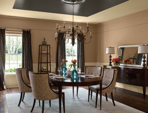
- When a kitchen is large enough to be called a dining room, its design can be approached in a very different way. In such a room you can receive guests, which means that you need to create an interior no worse than in the living room.
Classic color combinations, in this case, are chocolate, coffee, milk, cream.
living rooms
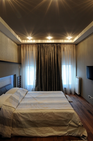
The bedroom is the only room where bright light is not needed. Therefore, for its design it is quite possible to use dark colors.
The only wish is that the combination of the color of the walls and the ceiling does not contain aggressive colors and intrusive patterns. Such a palette is unlikely to provide high-quality relaxation of the body.
The ceiling of the bedroom can be low, it even creates a certain comfort. To achieve this effect, it’s a good idea to make the shade of the ceiling 2-3 tones darker than the walls and floor.
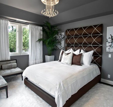
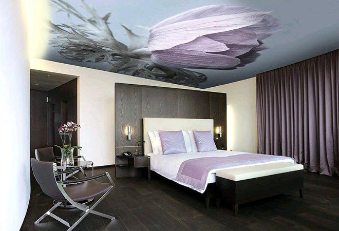
A win-win option for the bedroom is the starry sky ceiling color. They do it with the help of a stretch fabric or ceiling wallpaper with the appropriate pattern.
Although, there are those who want to have such a ceiling in the living room. But this is a matter of taste.
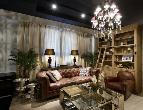
The living room is a universal room: they spend evenings in it, receive guests, sleep, for lack of separate bedrooms for each family member. Therefore, much more nuances need to be taken into account here.
If you are doing repairs with your own hands, a small instruction on how to choose colors so that the room is comfortable will not hurt. You can watch a video lesson, or you can rely on your intuition.
An excellent technique for decorating a living room can be considered a combination of several colors of different saturation. For example: a pale lilac ceiling goes well with an eggplant-colored wall.
And the other wall, pale green color, unexpectedly fits perfectly into the interior, which turns out to be unusual and cozy.
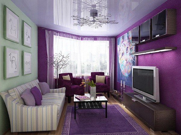
Such avant-garde colors in the design of living rooms are rare. We do not mean design work.
Very often in the decoration, the emphasis is on contrasts. This is not necessarily the contrast of the color of the walls and ceiling.
Oddly enough, these surfaces can be exactly the same color. In this case, in order to separate all surfaces with a clear line or break them into zones, they use a contrasting color of skirting boards, beams, polyurethane and plastic moldings.
For the same purpose, home textiles and furniture are used.
Another popular way of choosing colors is the game of shades. In this case, one color is taken as the basis, but in several of its shades.
As a rule, these are calm, not very saturated colors. An excellent example of such a selection is in the picture below.
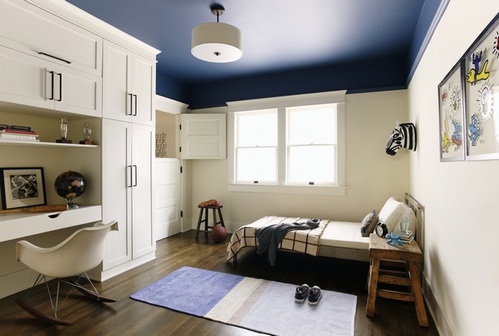
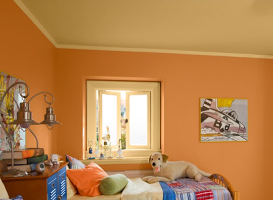
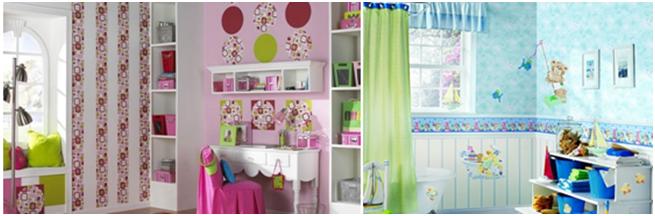
Children's room for kids should be light, bright and adequate to the perception of the child. Only dark and too aggressive colors are not used.
Variety of the room will be given by various applications in the form of balloons, funny animals and cartoon characters.
However, there is no wrong color, there is just an unsuccessful, illiterate choice. If your imagination is tight, contact knowledgeable people. Each service has its own price, but once you pay it, you will enjoy many years of relaxing in a cozy home.